Herb Lubalin

Yulia Brodskaya

Jennifer Morla
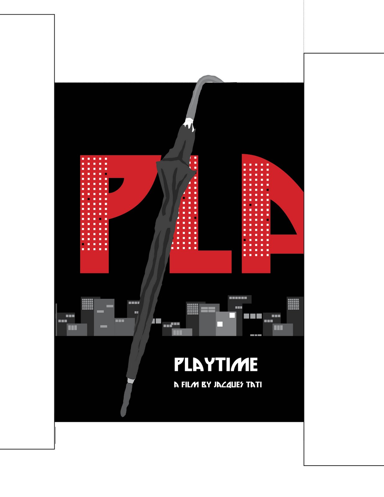
Project description -
This project consisted of each students picking 6 artist of interest to them and doing research on each one by looking on the internet then going to the library. After we had 6 artists we then narrowed the down to 3 and did more of a complex search containing finding 5 fonts for each artist and keying the color from one of their works of art. The goal of this project is to create a drop cap or illuminated letter in the style of the artist. The final project was to have 3 3x3" boxes one with the artist work then with our rendition of the artist work in one of their initials and then the drop cap used in context in the last box.
Project overview -
Overall this project was very enjoyable. This project had many angles that you could work from with allowed the students to go in any direction they felt they wanted. I enjoyed looking into some works and artist that I had not taken the time to look at and it was interesting to incorporate my design style off of the artist style. The time we had for this project was a perfect time frame to be able to create a realistic composition and be able to do the research as well.